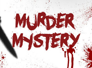
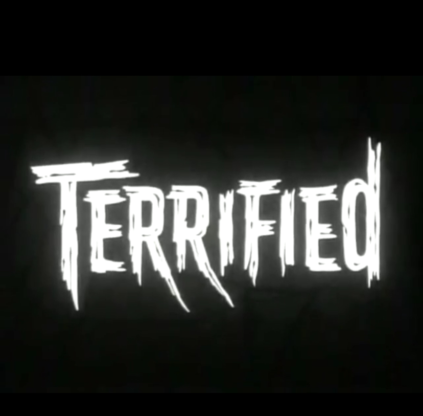
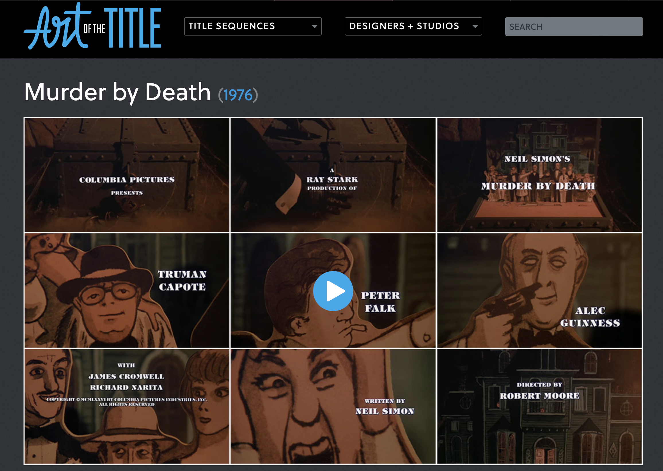
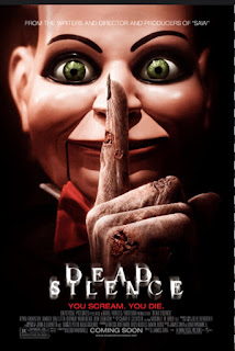
HELLO, WHAT’S UPPPP!!!! Today we will be sketching some title designs for our opening sequence. Since our movie is in the horror genre, I wanted to stay true to the conventions of giving it an authentic feel. Based on our pitch, we decided that our title is going to be called “Murder Mystery”. With our main title (working title) , I want the majority of the fonts seen to be red. I also want to add a drippy effect to the letters, resembling blood in a way for that scary aspect. MURDER MYSTERY! For the color, as I said I want the font to be about dark reddish color for our main title. For certain credits, like the directed by, etc. the color will be dark and bold for example AGM PRODUCTIONS. I also wanted to be creative and make some of the titles different sizes within one word, such as HoRrOR or hOrRoR. It all depends on the color of our background. The size of the font is important so that the audience is able to read the credits clearly. Through o...
